Article
Understanding the Bias Variance Tradeoff
In this article, we introduce a unified framework for understanding two competing evils in machine learning--overfitting and underfitting.
Introduction
In machine learning at large, sample complexity is at odds with model complexity:
- Model complexity: We want a sufficiently complex model to solve our problem. For example, a model as simple as a line is not sufficiently complex to predict a car's trajectory.
- Sample complexity: We would like a model that does not require many samples. This could be because we may not have access to much labeled data, a sufficient amount of computing power, enough memory, etc.
Say we have two models, one simple and one extremely complex. For both models to attain the same performance, bias-variance tells us that the extremely complex model will need exponentially more samples to train. Case in point: our neural network-based q-learning agent required 4000 episodes to solve FrozenLake. Adding a second layer to the neural network agent quadruples the number of necessary training episodes. With increasingly complex neural networks, this divide only grows. To maintain the same error rate, increasing model complexity increases sample complexity exponentially. Likewise, decreasing sample complexity decreases model complexity. Thus, we cannot maximize model complexity and minimize sample complexity to our heart's desire.
Intuition
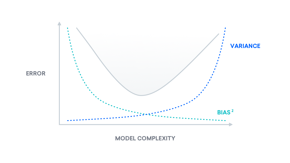
We can, however, leverage our knowledge of this tradeoff. In this section, we will derive and show the bias-variance decomposition, giving us a visual interpretation of the mathematics. At a high level, the bias-variance decomposition is a breakdown of "true error" into two components: bias and variance. We refer to "true error" as mean squared error (MSE), which is the expected difference between our predicted labels and the true labels. The following is a plot of "true error" as model complexity increases. Our goal in this section is to understand this curve.
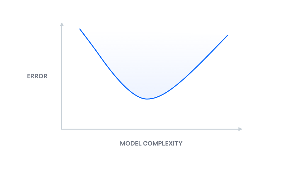
Notice there is a happy middle. The point of lowest error exists in the middle, and as we will see later on, the bias-variance decomposition explains why this graph behaves as it does.
We will examine the bias-variance decomposition using graphs in order to better understand its implications for real-world problems. We will use this geometric view to justify the bias-variance decomposition partway. This decomposition in turn will illustrate the bias-variance tradeoff we mentioned before.
Bias-Variance Decomposition
Let's start with the setup for the problem. We will use the ordinary least squares method, or, for simplicity, linear regression. If you'd like to learn more about least squares, we encourage you to read Adversarial Examples in Computer Vision: How to Build then Fool an Emotion-Based Dog Filter. We observe a number of points $(x, y)$ and our goal is to fit a line to these points. Recall the form for a line:
$$y = mx + b$$
Consider the set of all linear functions of $x$. In other words, consider the set of all lines, also known as a plane:
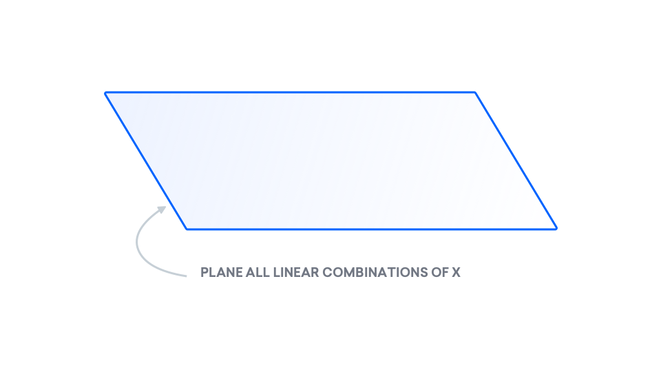
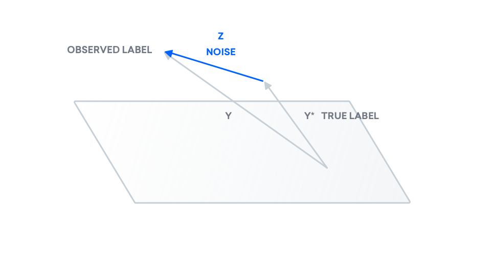
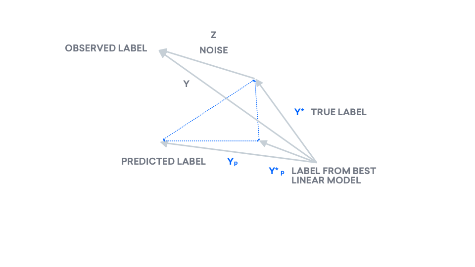
The points that we observe don't necessarily fit to a line, so the $y$ that we observe does not need to be in the plane.
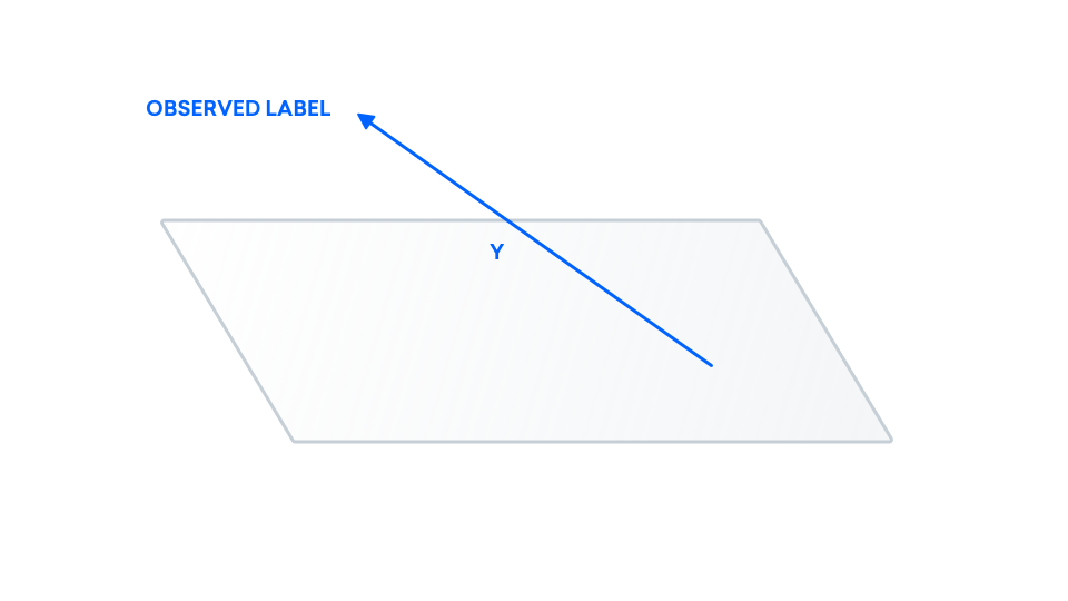
Here, we make a distinction between the points we observe ($y$) and the true points ($y^\ast$). This is because we may be observing noisy versions of the true data. Examples of real-life causes for this could be that we're using a faulty microscope or an inaccurate ruler, leading to inaccurate observed data. We can model this inaccuracy as some random value $z$ that is added to the true label.
$$y = y^* + z$$
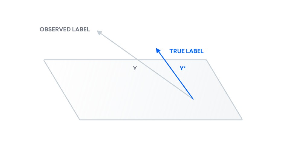
At the end of the day, we are interested in the difference between our true labels and our predicted labels. As a result, we add our true labels to the picture. We know our true data $y^\ast$ may not come from a line. As a result, $y^\ast$ may also exist outside of this plane.
We add noise to our true data to obtain our observed data.
We have our true labels, but we now need to draw our predicted labels. Using least squares, we compute a model and predict labels, which we call $y_p$. Recall that least squares predicts a line: $y_p$ is a line, and as a result, belongs inside of the plane. Consider $y_p$ to be the "shadow" of $y$, on the plane.
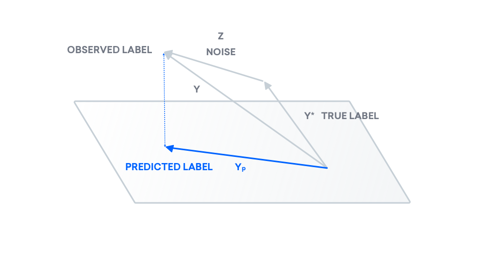
$y_p$ is currently placed directly beneath $y$, like a "shadow". If we try moving $y_p$ inside of the plane, does the dotted line representing the distance between $y$ and $y_p$, $|y - y_p|$ get longer or shorter? Imagine moving the tip of $y_p$ to the far right. The dotted line gets longer. To minimize the distance between $y$ and $y_p$, the latter must lie directly beneath the former. As a result, this vector $y_p$ is called the projection of $y$ onto the plane.
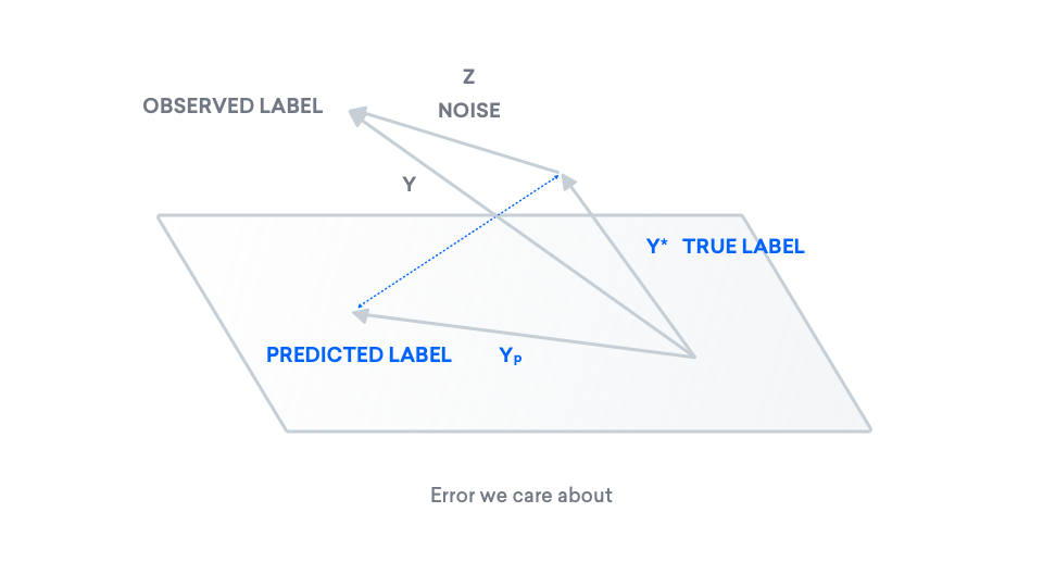
Now we have all the pieces needed to express our "true error". In this graph, the error that we care about is the distance between our true label $y^\ast$ and our predicted label $y_p$, formalized and illustrated below.
$$\text{error} = |y^\ast - y_p|_2^2$$
To understand this quantity, we can introduce another label, $y_p^\ast$, the projection of our true label onto the plane. For linear regression with 0-mean noise specifically, this is the best model in our class.
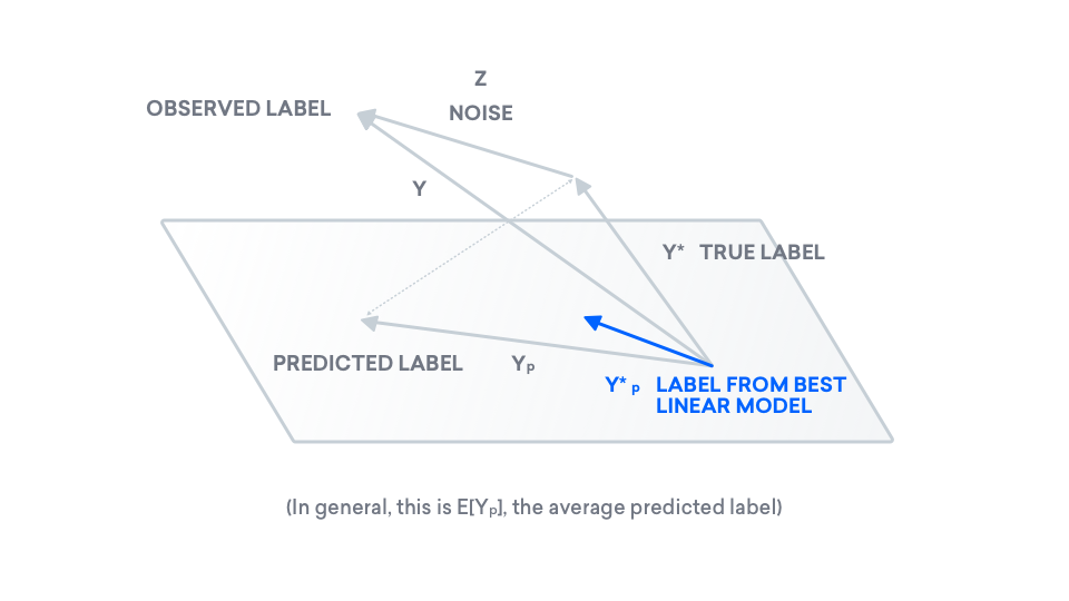
Now here's the kicker: with our new term $y_p^\ast$, we can rewrite our error in terms of two other vectors.
$$\text{error} = \|y^\ast - y_p\|_2^2 = \|y^\ast - y_p^\ast\|_2^2 + \|y_p^\ast - y_p\|_2^2$$What does this remind you of? Rewrite the above equation, and define a few variables.
$$\underbrace{\|y^\ast - y_p\|_2^2}_{a^2} = \underbrace{\|y^\ast - y_p^\ast\|_2^2}_{b^2} + \underbrace{\|y_p^\ast - y_p\|_2^2}_{c^2}$$Per the line above, set the left-hand side to $a^2$, the two terms in the right-hand side to $b^2$ and $c^2$, respectively. Substituting, we obtain a familiar equation.
$$a^2 = b^2 + c^2$$
This is Pythagorean Theorem: The Pythogorean Theorem relates the three sides of a right triangle, which have lengths $a$, $b$, and $c$. In other words, the Pythogorean Theorem holds the key to understanding our error $a^2$, by interpreting error as the hypotenuse of a triangle. It in fact decomposes $a^2$ into the sum of two terms, $b^2$ and $c^2$, making $b$ and $c$ the two legs of our triangle. Here is the equation, illustrated.
Bias-Variance Tradeoff
However, how is decomposing error into $b^2 = \|y^\ast - y_p^\ast\|_2^2$ and $c^2 = \|y_p^\ast - y_p\|_2^2$ helpful? First, let us name each of these terms. The first is called bias and the second is called variance.
$$\text{error} = \|y^\ast - y_p\|_2^2 = \underbrace{\|y^\ast - y_p^\ast\|_2^2}_{\text{bias}^2} + \underbrace{\|y_p^\ast - y_p\|_2^2}_{\text{variance}}$$We will analyze these two terms individually:
- bias $\|y^\ast - y_p^\ast\|_2^2$: Recall the first term $y^\ast$ is the true label and the second term $y_p^\ast$ is the best label in our class, in the linear regression setting. Notice that our prediction $y_p$ isn't in this expression. In fact, bias is completely independent of the predicted label. Instead, the bias is dependent on the plane only. If the plane was instead a three-dimensional blob, $y_p^\ast$ may be closer to $y^\ast$. In other words, if we considered more complex models, $y_p^\ast$ may be closer to $y^\ast$. In short, bias decreases with increasing model complexity.
- variance $\|y_p^\ast - y_p\|_2^2$: Recall $y_p$ is the predicted label and $y_p^\ast$ is the best label in our class, in the linear regression setting. Notice that now $y^\ast$ is missing entirely. In fact, variance is independent of the true labels. Instead, we only look at the best label in our class and compare that with our predicted label. In general, as the dimension of our "class" increases, these two vectors are with some probability further apart from each other, due to the curse of dimensionality--which states that in higher dimensional spaces, it is difficult to sample vectors that are close together. In short, variance generally increases with increasing model complexity.
Now, we have broken down the underlying mechanics of the MSE v. model complexity plot at the beginning of this section. In fact, MSE is the sum of two parts, as we have discovered, where one increases with model complexity and the other decreases with model complexity.
Conclusion
In short, a less complex model may lower our true error, even if our observed error does not reflect that. For a game as simple as FrozenLake, a neural network may be too complex for our cause. We will work with a simpler model, using the least squares method, in order to solve FrozenLake using fewer samples. If you'd like to learn more about least squares, we encourage you to read "Adversarial Examples in Computer Vision: How to Build then Fool an Emotion-Based Dog Filter" (link coming March 2019).